Guideline B
Provide access to forms for users who are blind or visually impaired.Forms are extremely useful for gathering all kinds of information. Web sites often present users with a log-in page that requires a name and password be entered into text fields. Radio buttons or check boxes are regularly used to determine user preferences, and users can answer test questions by typing answers into text fields. Forms can present problems for blind users when the elements aren't marked up in a manner that makes them accessible to screen-reading software. A screen reader might announce the presence of a text field, for example, but if it isn't labeled correctly, the user won't know what information to enter into the field.
To insure reliable access to information, use properly marked-up HTML forms instead of those created in proprietary formats, such as PDF or Flash. While some screen readers can access information in properly marked-up PDF or Flash, support is not necessarily 100% reliable. Providing a form in non-HTML formats may mean that screen-reader users or anyone who relies on keyboard-only navigation will be unable to use the form.
Checkpoint B1
Label all form elements and controls so they can be recognized by assistive technology, such as a screen reader.
Technique B1.1
Explicitly label all text fields, text areas, drop-down menus, checkboxes and radio buttons.
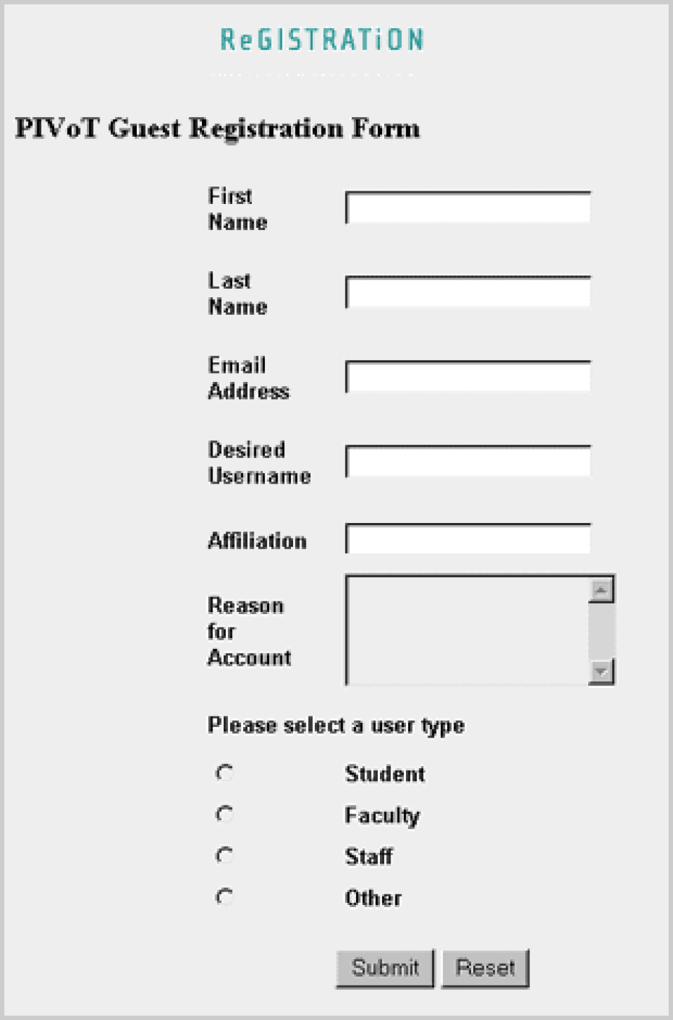
Each edit field or text area should have an explicit label associated with it that makes it clear what information to type into the box. A simple method is to use the label element. Below is a screen shot of a form containing text fields.

As a screen-reader user navigates this form, either by reading the entire page or by tabbing from field to field, the software will speak each label aloud. This is usually enough information for the user to know exactly what to type into the edit field itself. JAWS (a PC-based screen reader), for example, announces "First Name edit, Last Name edit," etc. The author has taken a simple approach and associated the visible label with the edit field, as shown in the markup below.
First Name
Last NameText areas, where users can enter longer strings of text, can be marked up in a similar fashion:
Please tell us what you expect to learn from this course.In some cases it may be desirable to give the user more information than is available in the visible label. One approach is to use the title attribute to supply additional information:
You can also use in-line styles to provide a hidden label for the screen reader to announce. There are two ways to do this. The first uses the CSS property display:none; the example below illustrates how class="hidelabel" is used to define a hidden element:
.hidelabel { display: none; }In the body of the document, enter the text you want the screen reader to announce and place it within a that refers to the style defined in the :
Enter your address accurately, as this information will be sold to third-party vendors.The same thing can be accomplished with the property visibility:hidden; — define the style in and then refer to the style at the appropriate place in the body. In both cases the screen reader will announce text which is invisible to sighted users. However, using visibility:hidden; will cause an in-line gap to appear on the page where the text would normally appear. Additionally, older browsers (such as Netscape 4.x) do not always support the visibility property properly.
Drop-down menus (also known as select menus or combo boxes) can also be marked up with label and id:
Please tell us when you expect to graduate.
Expected year of graduation20052006200720082009In this case, a screen reader will read the label ("Please tell us when you expect to graduate"), then the default text of the drop-down menu ("Expected year of graduation"), and will finally describe the form element itself: "Combo box, one of five. To change the selection, use the arrow keys." The user may then open the menu and use the arrow keys to make a selection.
To prevent the user's screen from changing unexpectedly, drop-down menus should never automatically redirect the browser to a new Web page (by using the onchange event handler, for example). Blind users or anyone who uses the keyboard instead of a mouse must be able to read through the entire list of choices before the action is executed. Instead, it's best to allow the user to make a selection and then press a button to invoke the action. For example:
Select a department at the schoolAdministrationEnglish DepartmentPhysics DepartmentHere, the user can make a selection from the list and then press the Go button in order to jump to that page. Automatically redirecting the user would cause the browser to act on the first item selected from the list and, in this case, a keyboard-only user would always be directed to the Administration department.
Other form controls, such as radio buttons, checkboxes and buttons, also need labels so users can identify and manipulate them. In the form below, three radio buttons are available. Each is associated not only with its adjacent label but also with its group identifier ("Please select a user type"), as shown below.

Please select a user type... Student
Faculty
Staff
In order to ensure the group identifier is properly associated with the appropriate information, always place it before that information. Also note that the radio buttons themselves have been positioned before their labels. This approach ensures that all screen readers associate the proper labels with their respective form controls.
In situations where a single label must identify multiple form elements, use the title attribute to identify the elements. An example of using title on text fields is shown below, but this attribute can also be applied to radio buttons and check boxes if necessary.

Technique B1.2
Label all buttons.
Buttons, such as those that submit user information or invoke an action, must also be labeled. If text buttons are used, set the value to describe the button's function. If the button is a graphic, use alt that states what the button does — for example, "Search," "Go!," "Submit," etc. Either type of button can be easily made accessible. Below are two simple examples illustrating the use of text buttons.

Here is a code sample from a form that uses a graphic button and descriptive alt.

More information about creating accessible forms can be found in the Web Content Accessibility Guidelines .